Biblia Sacra
Bibles printed in the Netherlands and Belgium
Bibles as physical objects
I. Title page
A remarkable evolution from the early years of the printing press is the rise of the title page. Biblia Sacra shows the development within bibles:
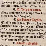
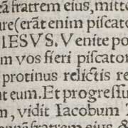
1. Epistels and Gospels. Zwolle, Peter van Os van Breda, 1488. a2r
This edition does not have a separate title page. However a short title and the main text begin on the second leaf of the book. The signature 'a2' appears at the bottom of the page, indicating that the first blank leaf was cut away.
2. Psalter. Zwolle, Peter van Os van Breda, 1491. [a]1r
As a blank page obscured the identity of the book, the short title was sometimes printed on it.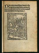
3. Psalter. Antwerp, Adriaen van Bergen, 1508. [a]1r
Initially, the first page was decorated with ornaments and illustrations.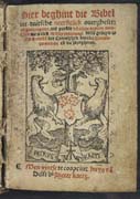
4. Old Testament. Antwerp, Peter Kaetz, 1525. vol. 1 : a1r
Later on, the imprint appeared on the title page to announce the place where the edition was printed and/or sold.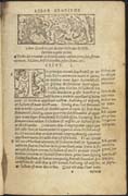
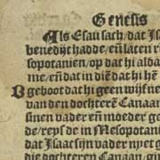
5. Bible. Antwerp, Jacob van Liesvelt, 1526. vol. 1: a1r
And finally advertising language was used to sell as many copies as possible. On this title page just the simple words 'Dat Oude ende dat Nieuwe Testament' (=The Old and the New Testament) were sufficient, since it was the first complete printed bible in common Dutch.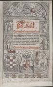
6. Bible. Antwerp, Willem Vorsterman, 1528. vol. 1: \pi1r
The cardinal's hat on the title page of this bible vouches for the reliability of the translation. It also denotes summaries of chapters and a vast number of beautiful illustrations.II. Layout
While the first printed books still resembled manuscripts, editions printed after 1520 were increasingly developing their own characteristics. Printers started to experiment with the layout in order to achieve more clarity. New elements in the layout of the text were introduced and eventually typical features of manuscripts were abandoned. By increasing the legibility of texts, printers tried to meet the wishes of a new reading public that was not used to reading large pieces of text.
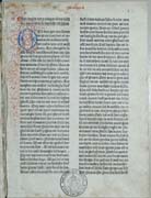
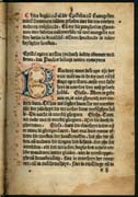
1. Old Testament. Delft, Jacob Jacobsz. van der Meer & Mauricius Yemantsz., 1477.:vol. 1: 1r
The structuring of the text is done entirely by hand. Observe the painted initial and the rubricated capital letters.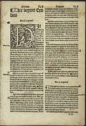
2. Bible. Antwerp, Jacob van Liesvelt, 1526. vol. 1: d3r
All handwritten structuring has disappeared. Individual sentences are not marked by rubrication, but larger units of the text are divided into paragraphs. Larger type is used for the book heading. Typographical differentiation could create a much more elaborate hierarchy in the text.
3. Bible. Antwerp, Willem Vorsterman, 1528. vol. 1: d1r
Typographical differentiation is further developed. Different typefaces are used for the book title, the summary of the chapter, the chapter heading and the first line of Exodus 1.III. Printing types
Traditionally the vernacular bible was printed in gothic, the typeface of the people. The Latin bible was printed in roman from ca. 1525 onwards. To print bibles, various gothic and roman types were used, sometimes even within one edition.
Bibles in Dutch
1. Bible. Antwerp, Jacob van Liesvelt, 1526. vol. 1: b6v
Henric Pieterszoon Lettersnijder's English textura (commonly-used gothic typeface for bibles in the Dutch language)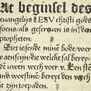
2. New Testament. Delft, Cornelis Lettersnijder, 1524. f5r
De Keyser's 2-line English Bastarda (rarely used gothic typeface for bibles in the Dutch language)Bibles in Latin
3. New Testament. Antwerp, Michiel Hillen van Hoochstraten, 1525. h8r
Roman type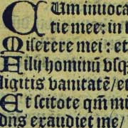
4. Psalter. Antwerp, Jan van Ruremunde, 1550. vol. 1: a2r
English-bodied French Textura. The gothic type remained popular in Latin Psalters for a long time.Variable use of type and colour within one edition
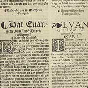
5. Bilingual New Testament. Antwerp, Matthias Crom, 1539. E3r
The Latin text is printed in De Croock's Small Pica Roman and the Dutch text is printed in Lettersnijder's Pica Textura